Humans are, by nature, very visual beings; a picture can be worth 1000 words, so long as you have the right image. Images are so important in social media because they allow you to communicate more with your audience; your followers get to see more of you, creating a personal feel to your business and can allow them insight into the activities and daily running of your business. With images, you can tell a story or express a thought much better than a written article ever could.
We often hear that business owners struggle with social media image creation to accompany their posts. As part of our Social Media Essentials Club, we help with content creation, that will reflect your brand for you to use across your social media as you see fit.
Using relevant images on social media allows you to gain attention, build loyalty, communicate vital information, and increase engagement. In simple terms, when you stay consistent and connect images with your marketing messages, your brand will have more staying power.
Why do I need images on social media?
If you’re not creating and using visual elements in your content, you’re likely missing out on lots of engagement from your audience and the opportunities that engagement brings for your business. Social media is a crowded space, and using images is a great way to grab attention. Did you know, a social media post accompanied by a photo is ten times more likely to get engagement?
It’s no surprise that a social media post accompanied by a photo is ten times more likely to get engagement than a simple text post; we all spend more than enough time scrolling through our social feeds to know that you’re more likely to stop and look or read an image than stop and ready a piece of text.
Of course, to get the attention you really want, you have to share images that are of interest to your target audience. If you’re focused on parents and children, you want to find out what visuals matter to your prospects and fans and use this knowledge as the basis for the type of content you should be creating.
Using the same branding across all your social media channels is a sure-fire way to make your business easily recognisable, through associated colours and designs. Take McDonald’s for example, you would instantly recognise their colours no matter where they appeared. In addition, keeping a visual brand identity consistent will help people understand that all your social media accounts are connected.
Social Media Image Creation – How do I create a good image?
Strong visual content on social media gives people a reason to follow, like, comment, and eventually buy from you, but you don’t have to be a graphic designer to create great images to accompany your messages across social media. You don’t need heavily filtered images to get attention and you definitely don’t need to spend hours creating one image that looks great but uses all of your time that could be better spent on other aspects of your business.
Once you have a good bank of images that are well branded and represent your business well, you can reuse them as and when you see fit, you don’t have to reinvent the wheel each time you need an image to accompany your copy.
A good image clearly conveys information that needs to be used or will include a suitable relevant image. You should have a goal for each image so before you start creating you can keep in mind the reason for that image and what you’re trying to achieve, whether it’s to drive traffic, increase engagement, gain followers or supply information.
Always, always, always follow your brand. Most businesses will already have brand guidelines to follow that differentiate you from your competition and give you a clear identity. Don’t forget your logo! Your business’ logo is like a personal signature – It can help you boost your brand recognition, promote your services, and protect your work from people looking to take your fabulous images.
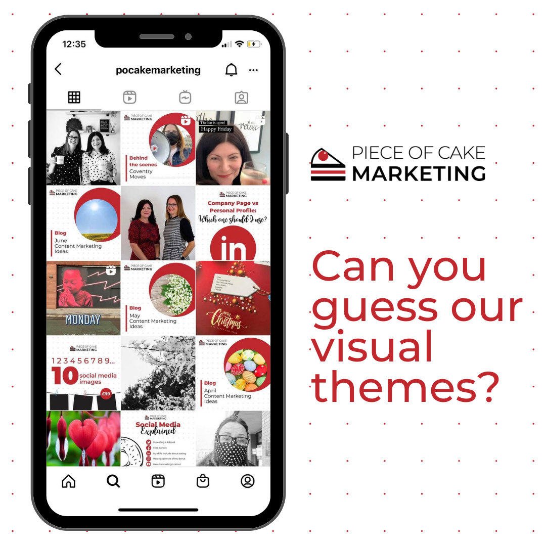
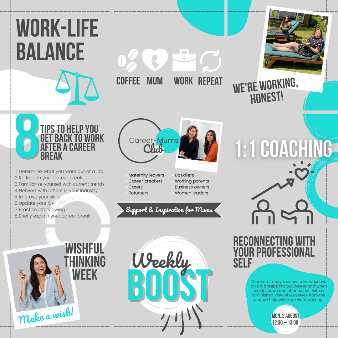
If you look across social media at different businesses or even personal profiles, you’ll quickly get a feel for their visual theme, especially on Instagram. Visual themes are a recognisable feature in your social media that follow a certain theme across each image whether it’s by colour, filter, font selection/design, template, or type of image/content- there are many more to list, but it might be easier if we show you…here’s ours: Can you guess our visual theme?
Social Media Image Creation – What does a good image look like?
Graphic design is the art of visual communication with combined words, symbols and images to represent ideas and emphasise messages, in other words – a good image can tell you a lot about a company.
Whether you know it or not, all companies have a brand identity and visual language on social. Each of the images we create for a client is branded to their business, creating easily recognisable graphics to accompany messages. When images follow a simple brand guideline it can make a huge difference to how your audience see your business and how easily you are recognised.
People are only going to click on your image, share it or like it if it resonates with them. This is why you always need to keep your audience in mind and create images they want to see.
Social Media Image Creation – Simple design rules
Switch it up and have fun – don’t just do the same time and time again, people like variety, whether it’s vanilla or chocolate ice cream or your social media images. For our clients, we follow the brand guidelines when creating their images, but change the layouts, designs and bring in small accents, whether it’s through colour, shapes or fonts.
Balance – balance and proportion is the consideration of even the smallest detail as part of the whole design, even something small can throw off the entire design so be mindful of how you set out your images. Contrast also provides balance and is easier to read, black on white works every time, but complementary colours can bring more colour into your image.
Avoid Information Overload – you don’t want to completely overload your audience will endless information all clouded together in one image, include the necessary information, but keep it easy to read, short and snappy. Including an image is also a great way to counteract character counts; Twitter has a 280 character count, but by including an image, you can include more information if needed.
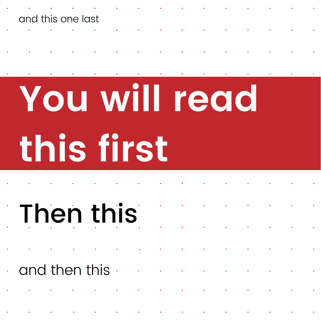
Simplicity is king – avoid busy designs; no one wants to have to figure out an image like an optical illusion, an image that is easy on the eye is going to be more audience-friendly and convey a message much more easily. Is there text that needs to be clearly visible to your audience? Follow the basic rule in the picture below, this will ensure that your readers will view the most important information first.
Social Media Image Creation – The Basics
Colours – colour is irreplaceable, it’s a powerful form of communication. Colour can sway thinking and cause reactions. We all know the colour wheel and the different emotions/thoughts associated with them;
Red – driven, determined, passionate, powerful
Orange – creative, confident, friendly, easy-going
Yellow – Warm, happy, energetic
Green – Vitality, calm, healthy
Blue – orderly, idealistic, reliable
Purple – wisdom, dignity, ambition
Shapes – adding shapes into your design can transform a simple image, breathing life into something more interesting and appealing to the eye – can divide an image between messages, images or just to add a splash of something different in your design. Lines can also help create movement and direction across a design, bringing the eye across the page in different ways, also consider the thickness and the type of line you use, the thicker the line, the more visible- is it an accent or a key part of your design?
Images – images don’t just reflect a particular emotion but also create a relational association between the viewer and that image. We all know when scrolling through an abundance of content most people are more likely to stop at an image in comparison with a long piece of text. Your choice of image along with the placement go hand in hand. Is the image just to accompany the design or is it a key feature? Do you want your audience to see the image first, or read the text first, background or forefront, the choice can make all the difference in the message that you’re portraying to your audience.
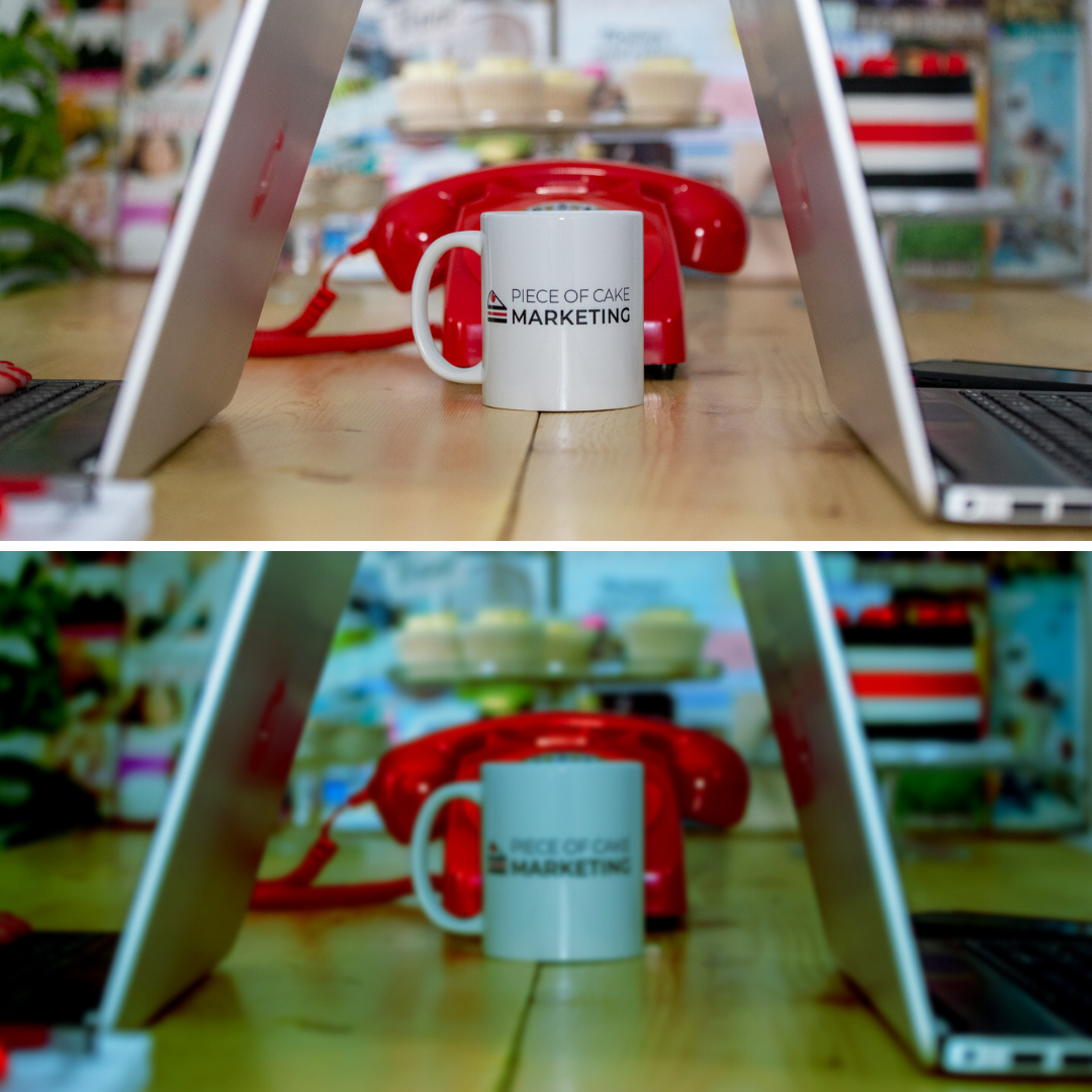
Image Quality – It’s always best to use the highest quality images that you can, if you use low-quality images the end product will not be one that will attract eyes or engagement. Take the image below as an example, which image would you be drawn to the most
Size – Across every social media channel, the image size is different, so to make sure the images can be seen fully, you’ll need to take note of the different size guides for each channel, luckily for you, we’ve done it for you; here’s our social media image size guide FAQ.
Social Media Image Creation – We Love Canva
If you’re just starting out in your social media image journey and want to try creating your own, we highly recommend Canva. It’s a graphic design tool that makes creating custom graphics easy. It’s easily accessible by phone or tablet and is completely user friendly, allowing you to make great images without needing to be an expert in graphic design. We have used it for a while now to create fabulous content for clients. With its own bank of images, design elements, animations, fonts and more, Canva makes it as easy as possible to get started with creating your own images. There are lots of templates to choose from for each different type of image you may be creating and also each different social media platform.
There is a free version that gives you almost all of the features available or there is also a paid version, Canva Pro, offering extra features with your account from background remover, transparent background to allow for vectors, easy storage solutions with folders and a larger capacity of options. We created a document that helps you get started on Canva and help you create great social media images.
How to incorporate images into social media
We create images for both our business and our clients’, each image is designed with a different audience in mind and requires a different message to be associated with it. Not every post needs an image, there should always be a good mix of text and image posts. Typically, we design images that go alongside a client’s monthly content, complementing the text and information and bringing the content to life through the images we provide. There are so many kinds of images we like to use when creating social media content;
Quote Images:

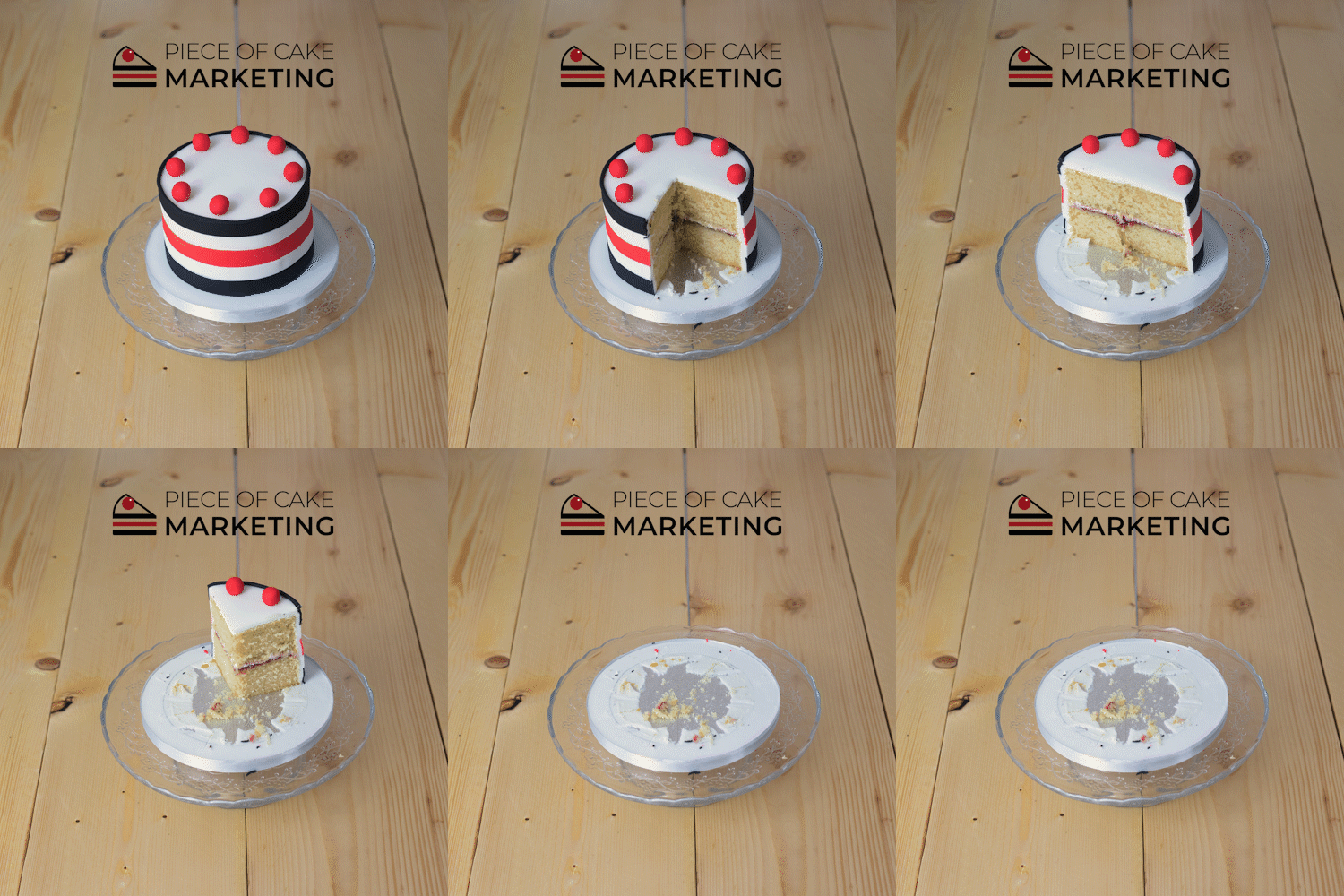
Gifs
Infographics

Memes

Information Posters

Grid Posts
How we can help you
If you’re looking for help with your social media images, we can help you. We can use our expertise and experience to design a bank of images for your business, carrying your business, brand identity and informative messages. We aren’t happy with the standard and boring, we like to inject fun and creative content into each and every design. You can book your space by emailing hello@pieceofcakemarketing.co.uk
Examples of our work

